Branding a Podcast
2023 • Marooned Podcast • Brand Designer, Illustrator
“Thoughtful brand systems can scale across unpredictable use cases.”
Info
The Client: Aaron Habel (Generation Why) & Jack Luna
My Role: Brand Designer & Illustrator
Timeframe: Six weeks (initial engagement, ongoing support)
The Challenge
Podcast branding presents a unique challenge: artwork must remain visually striking at full scale while still legible as a small thumbnail on platforms like Spotify and Apple Podcasts. It must quickly communicate tone, differentiate from competitors, and serve as the anchor for all future marketing.
Aaron Habel, a 10-year veteran in the true crime podcast space, and his new co-host Jack Luna, needed branding for their new show, Marooned: Harrowing Tales of the Catastrophically Lost. The goal was to create a flexible identity that not only reflected their thematic vision but could also adapt episode by episode.
Mandate: Deliver a logo and branding system that:
Stands out in crowded podcast directories.
Captures the emotional tone of “hope” within bleak narratives.
Provides flexibility to incorporate unique identifiers for each episode.
Approach & Workflow
Stakeholder Alignment
Conducted initial discovery sessions with the hosts.
Gathered descriptive requirements: vintage, travel pamphlet, stylized, beach-y, trees, hope.
Established a digital collaboration board for feedback and visual reference sharing.
Comparative Analysis
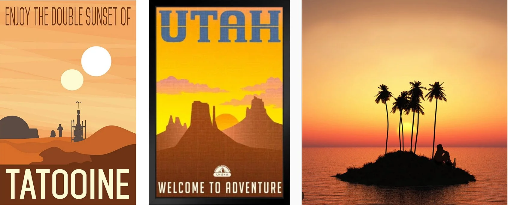
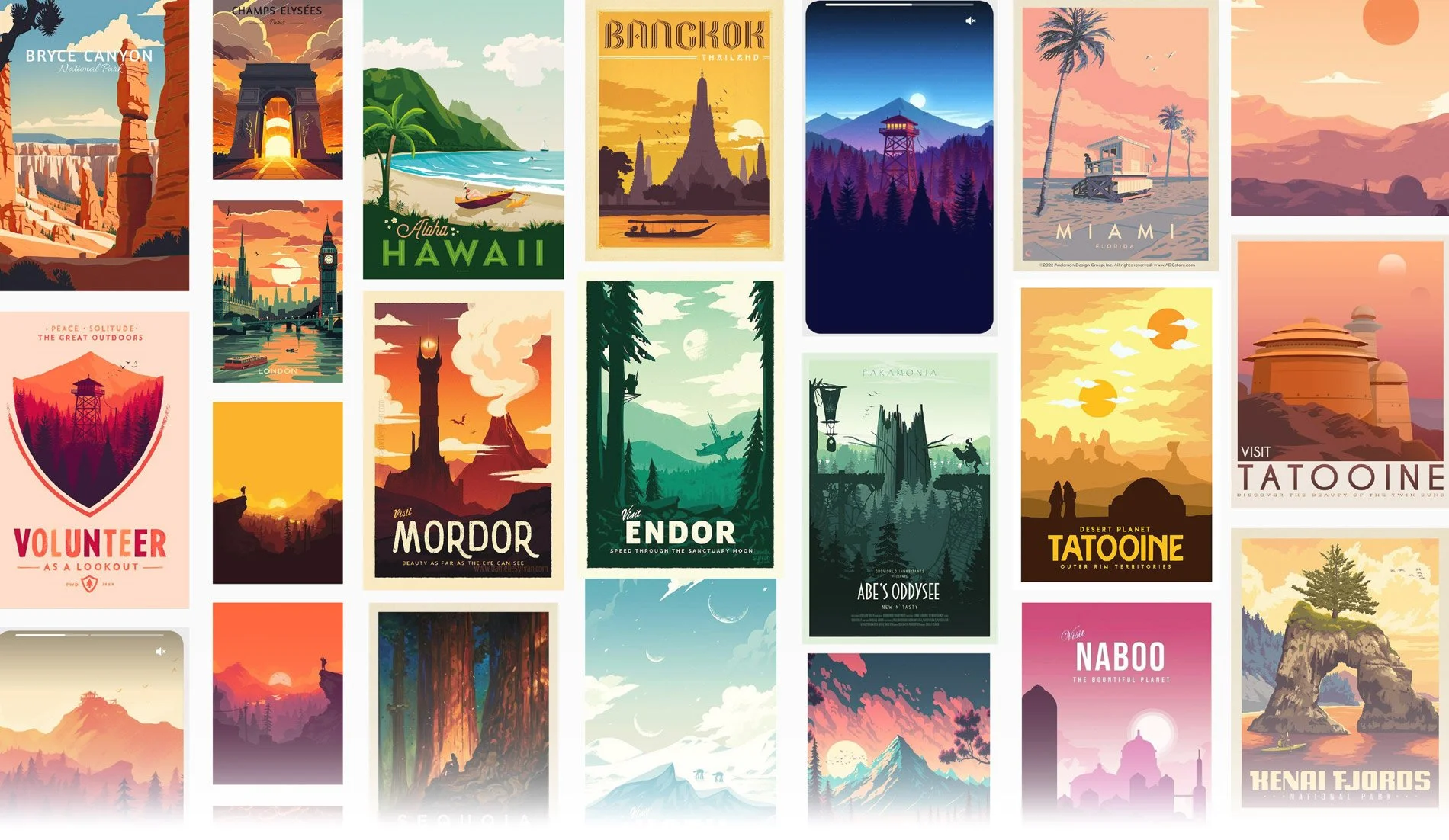
Researched vintage travel posters to study typography, composition, and iconography.
Identified patterns (“Visit [location]”) and adaptable design motifs.
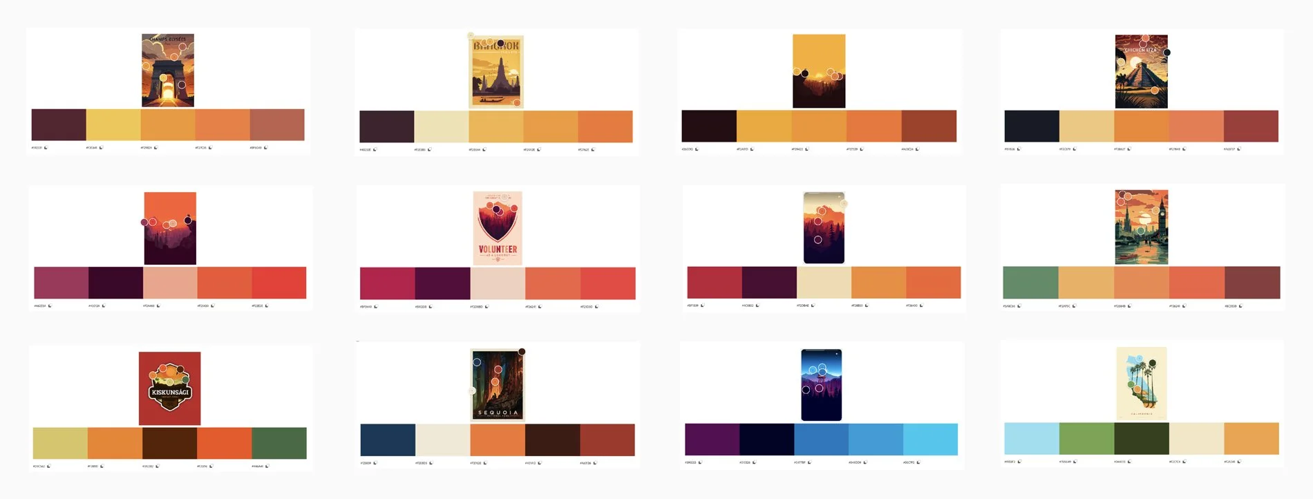
Color Strategy
Leveraged Adobe Kuler to extract warm, hopeful palettes from vintage references.
Prioritized tones that would counterbalance darker narrative themes.
Concept Development
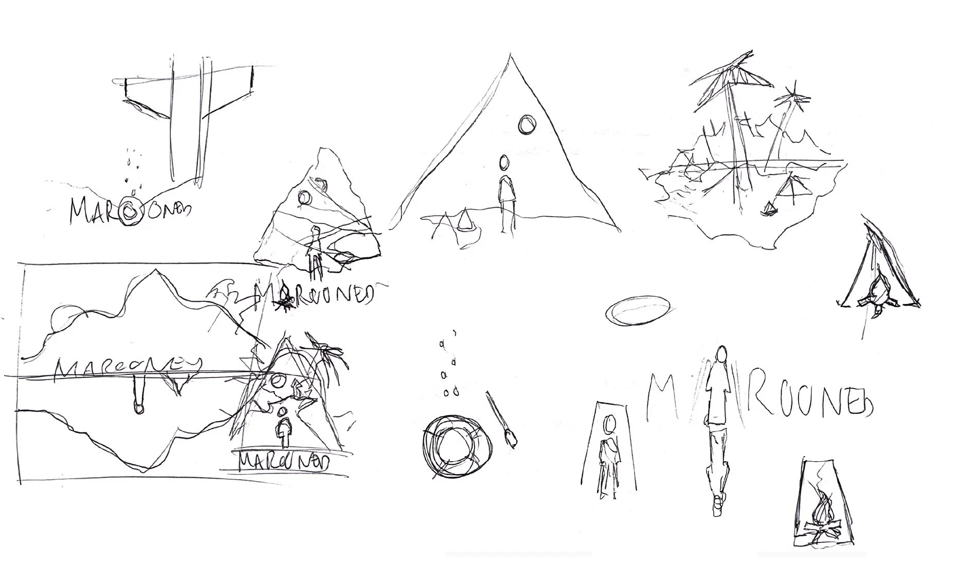
Sketched multiple “castaway survivor” thumbnails (washing ashore, cave view, SOS signs).
Narrowed focus to a deserted shoreline concept — flexible enough to incorporate episodic identifiers.
Transitioned from low-fidelity sketch to color prototype using selected palette.
The Recommendation
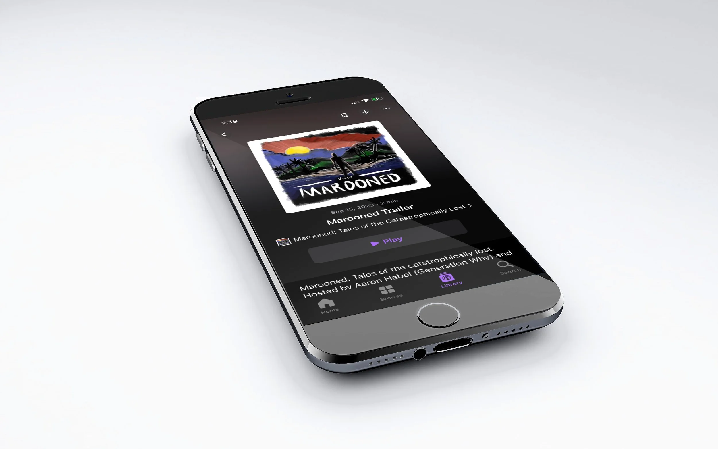
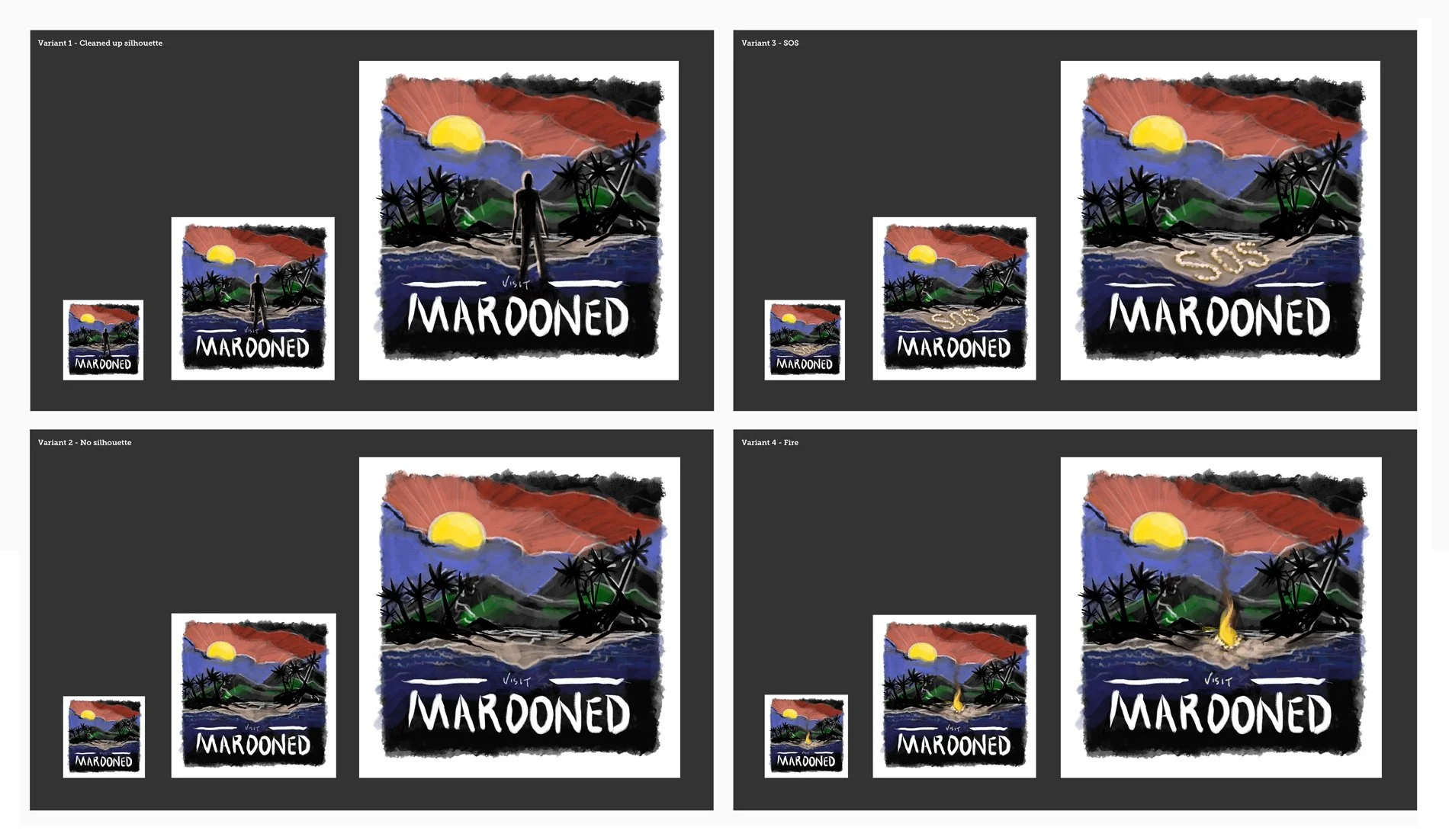
Delivered a low-fidelity illustration featuring a stranded figure arriving on a beach.
Proposed using interchangeable shoreline objects (fire, tent, SOS rocks) as episode-specific markers.
Developed a typographic treatment using a hand-drawn style aligned with the “vintage travel” theme.
The Response
Despite expectations of pushback, the client embraced the first iteration fully.
To their surprise, the rough, hand-drawn style offered standout differentiation in crowded thumbnail feeds.
Rather than refine into higher fidelity, the client chose to preserve the organic, imperfect quality of the initial design.
Results & Impact
Deliverables
Final podcast logo and cover artwork in multiple formats.
Episode-specific variations for ongoing use.
Merchandising-ready shoreline artwork.
Outcomes
Distinct Market Positioning: The intentionally rough style created visual differentiation in the History category.
Extended Collaboration: Engagement expanded beyond brand design into ongoing episode illustrations.
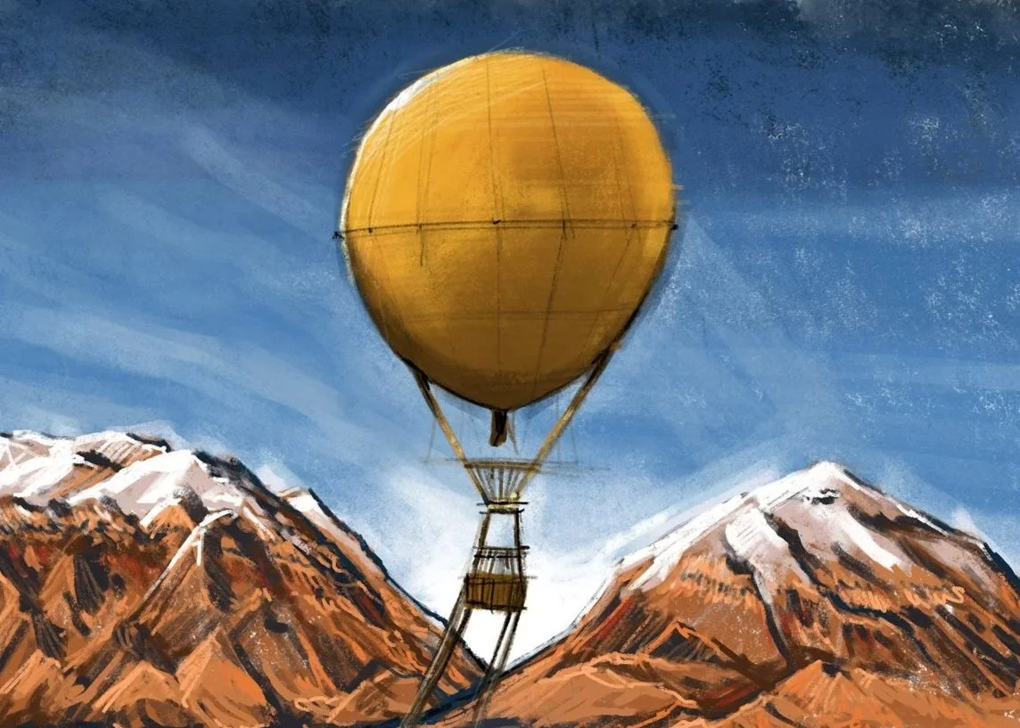
Scalable Creative System: Episode artwork adapted not only for islands but for mountains, deserts, Antarctica, underwater, and even space — each time reinterpreting the “lost” theme while retaining brand identity.
Challenges Overcome
Episode topics sometimes lacked clear physical identifiers (e.g., lost at sea). To solve this, landscapes and environmental elements (sunset, mountains, shoreline) were dynamically adapted into each new design.
Balanced thematic tension: blending “hope” with “harrowing” stories through selective use of color and composition.
Key Takeaways
By creating a flexible design system rooted in adaptability rather than static templates, the Marooned brand became more than just podcast cover art. It evolved into a visual storytelling device that reinforced the emotional core of each episode while maintaining strong brand recognition.
This case demonstrates how thoughtful brand systems can scale across unpredictable use cases — a lesson directly applicable to product design, where flexibility and differentiation drive both user engagement and long-term success.